

Here
Here
we
we
Go !!
Go !!


Here
Here
we
we
Go !!
Go !!


Here
Here
we
we
Go !!
Go !!


Here
Here
we
we
Go !!
Go !!


SWEETUTURN
SWEETUTURN
SWEETUTURN
SWEETUTURN

PROJECT BRIEF
PROJECT BRIEF
PROJECT BRIEF
Objective: The client aimed to launch a new subsidiary, SWEETUTURN, focused on offering specialized and personalized treatment for diabetic patients. Their unique selling propositions (USPs) included customized diet and lifestyle plans crafted by medical specialists to help manage diabetes effectively.
Scope: I was tasked with developing a modern and engaging brand identity that resonates with the target audience and aligns with current design trends. In addition, I designed a user-friendly website on FRAMER that captures the full journey of SWEETUTURN, from its vision and mission to the services offered.
MY ROLE
MY ROLE
MY ROLE
Brand Design
Logo Design
Web Design
Product Design
Visual Design
Brand Design
Logo Design
Web Design
Product Design
Visual Design
Brand Design
Logo Design
Web Design
Product Design
Visual Design
PROJECT TYPE
PROJECT TYPE
PROJECT TYPE
Client Project
Health
Parent Company - AmazeClinics
Framer Web Design
Client Project
Health
Parent Company - AmazeClinics
Framer Web Design
Client Project
Health
Parent Company - AmazeClinics
Framer Web Design
BRAND DESIGN
BRAND DESIGN
BRAND DESIGN
BRAND DESIGN
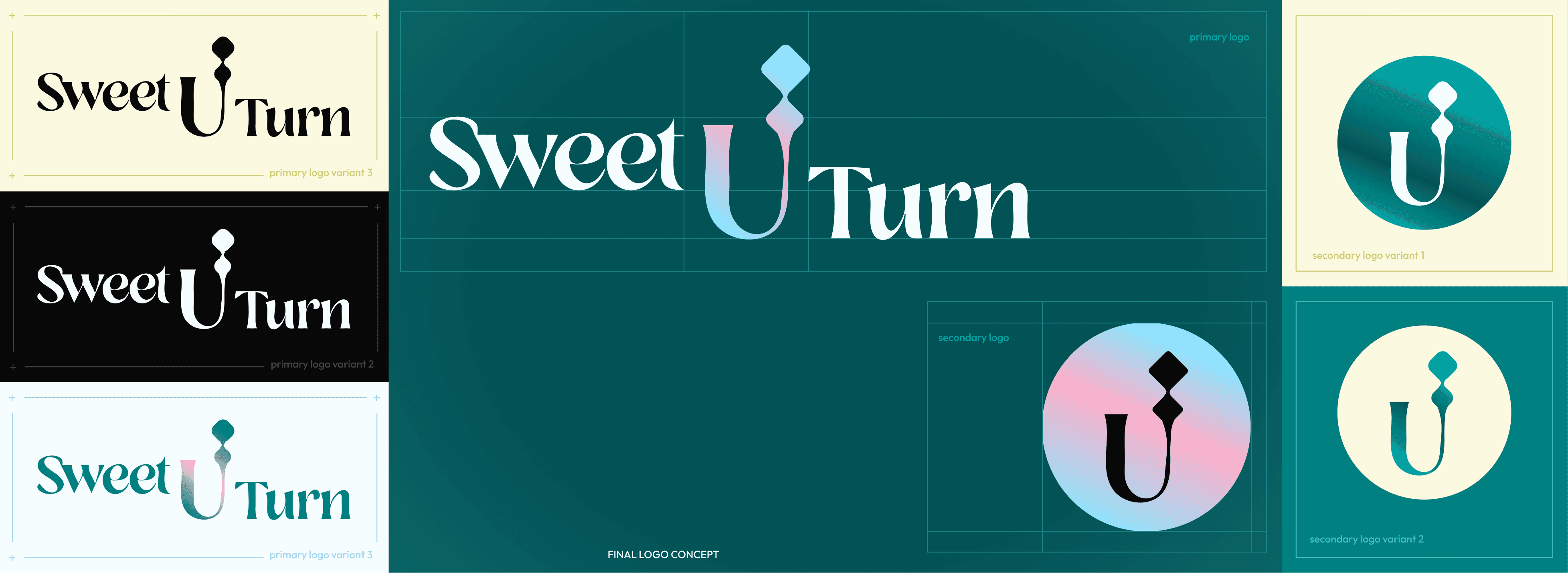


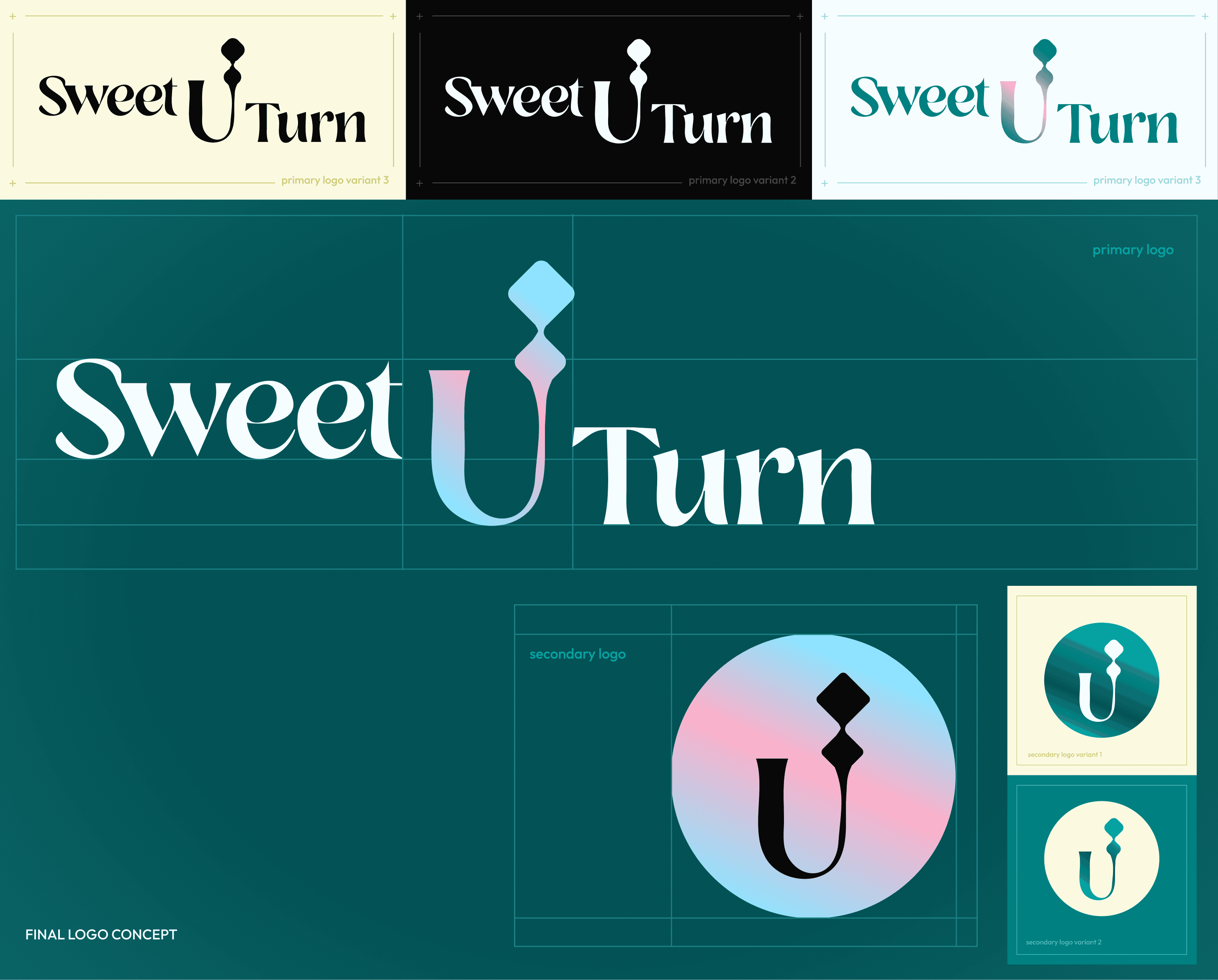
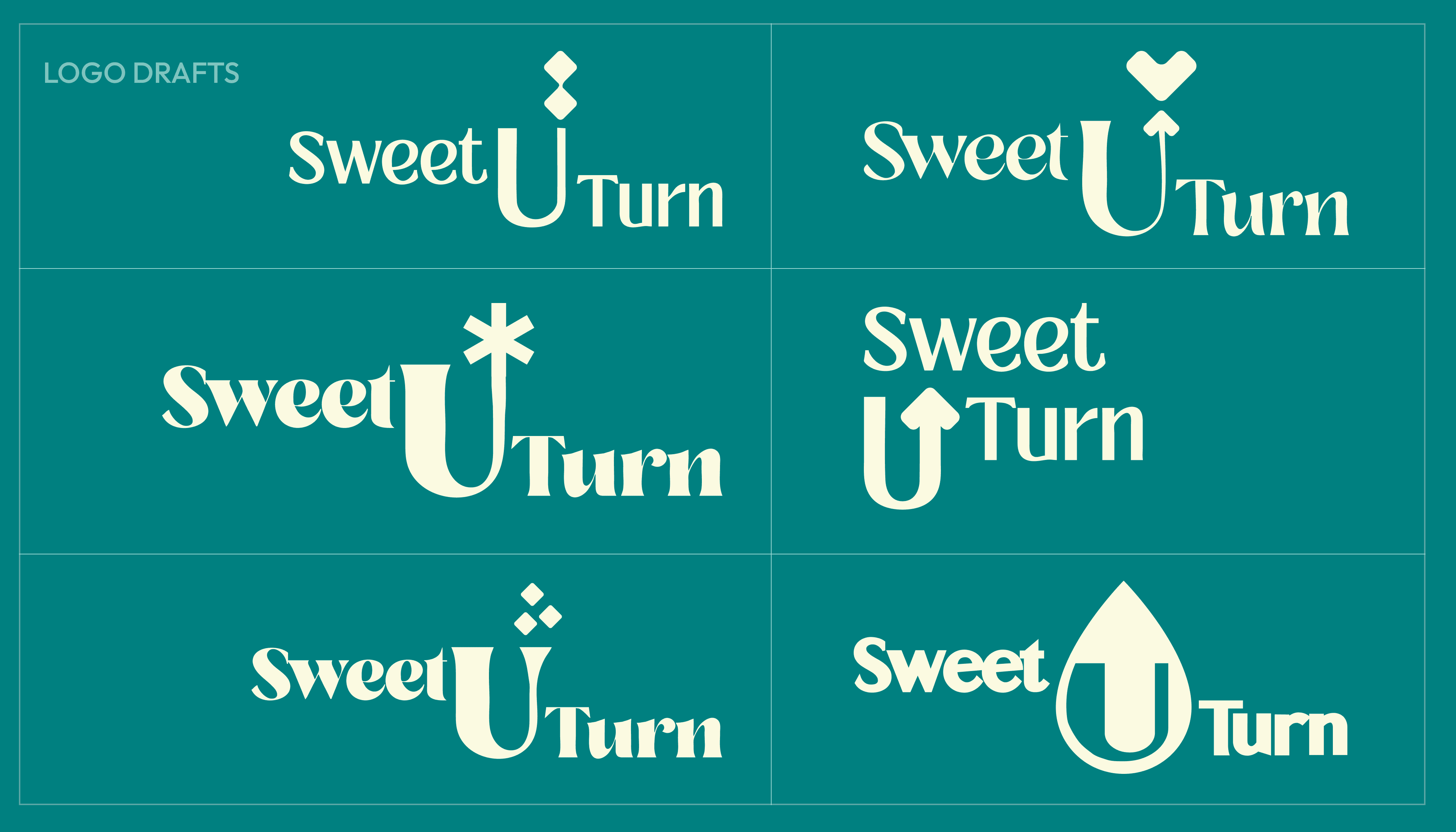


LOGO CONCEPT: The client wanted the full name SWEETUTURN in the logo. I designed iterations around the "U-Turn" concept, symbolizing a return from diabetic life, while keeping the design elegant and modern.
LOGO CONCEPT: The client wanted the full name SWEETUTURN in the logo. I designed iterations around the "U-Turn" concept, symbolizing a return from diabetic life, while keeping the design elegant and modern.
LOGO CONCEPT: The client wanted the full name SWEETUTURN in the logo. I designed iterations around the "U-Turn" concept, symbolizing a return from diabetic life, while keeping the design elegant and modern.


LOGO CONCEPT: The client wanted the full name SWEETUTURN in the logo. I designed iterations around the "U-Turn" concept, symbolizing a return from diabetic life, while keeping the design elegant and modern.


TYPOGRAPHY - For the logo, I used Losta Masta Regular, a refined and playful font. Bespoke Serif Variable was chosen for headers for its bold, modern tone, and Outfit Regular for body text to ensure clear readability across all brand assets.
COLORS - The palette blends medical tones with themes of rebirth. Soft pinks evoke sweetness, while the overall look creates a premium feel for the brand and its clients.


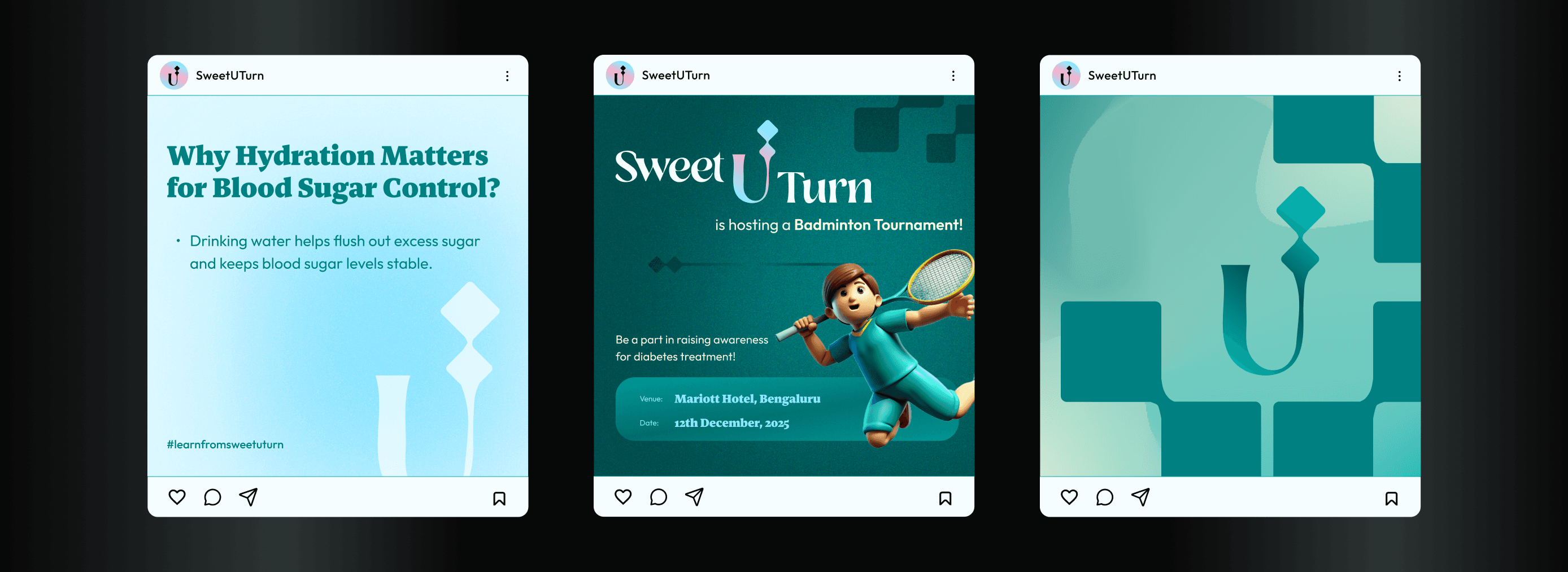


The brand identity was crafted to stand out and capture attention across social media and physical assets. I incorporated 3D elements using plastic and ceramic materials relevant to the brand.
+ I also developed a tagline: "It's time for a SweetUTurn towards a diabetes-free destination," designed to integrate seamlessly with the brand name, differentiating it from competitors.
MERCH DESIGN
MERCH DESIGN
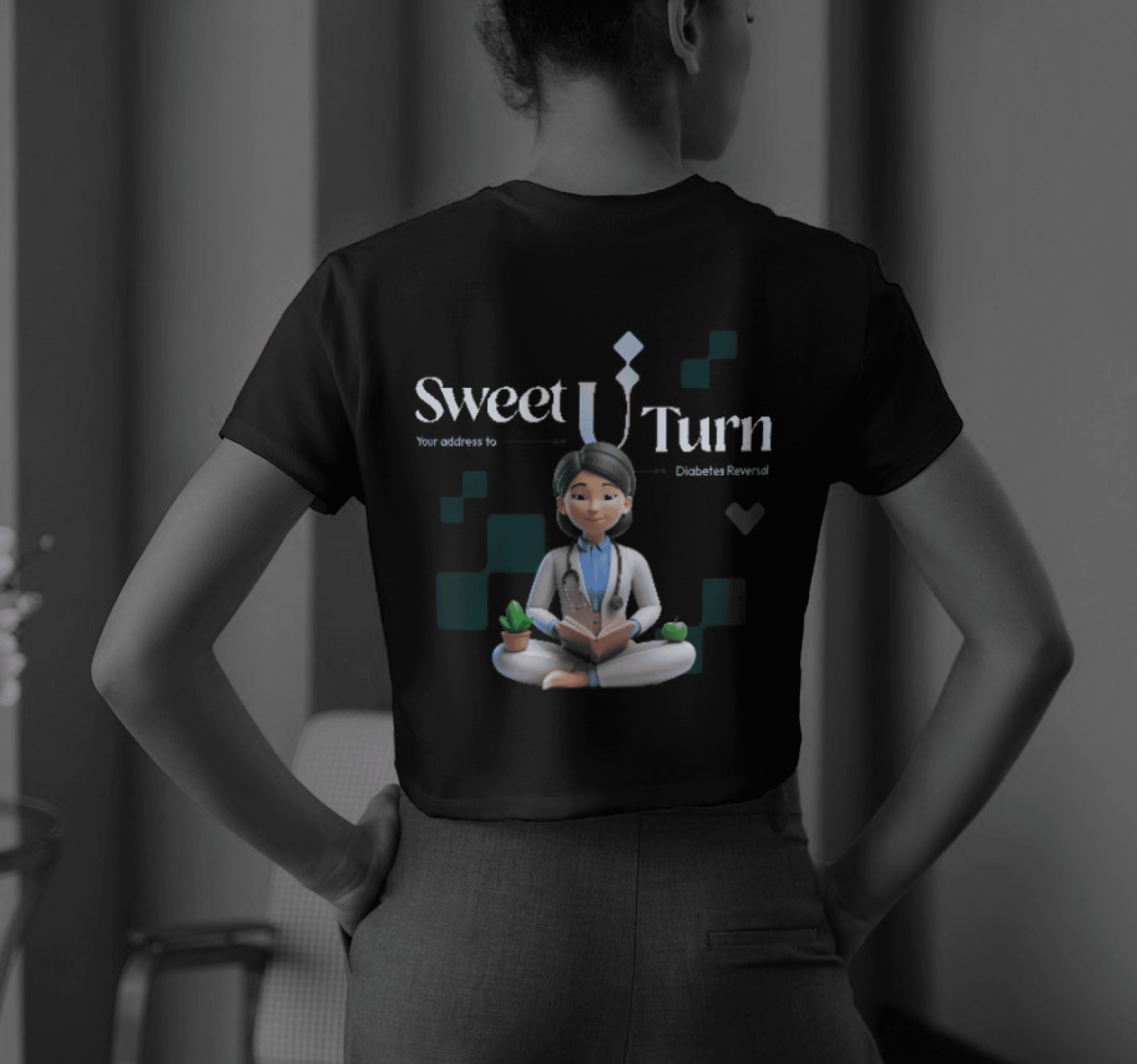


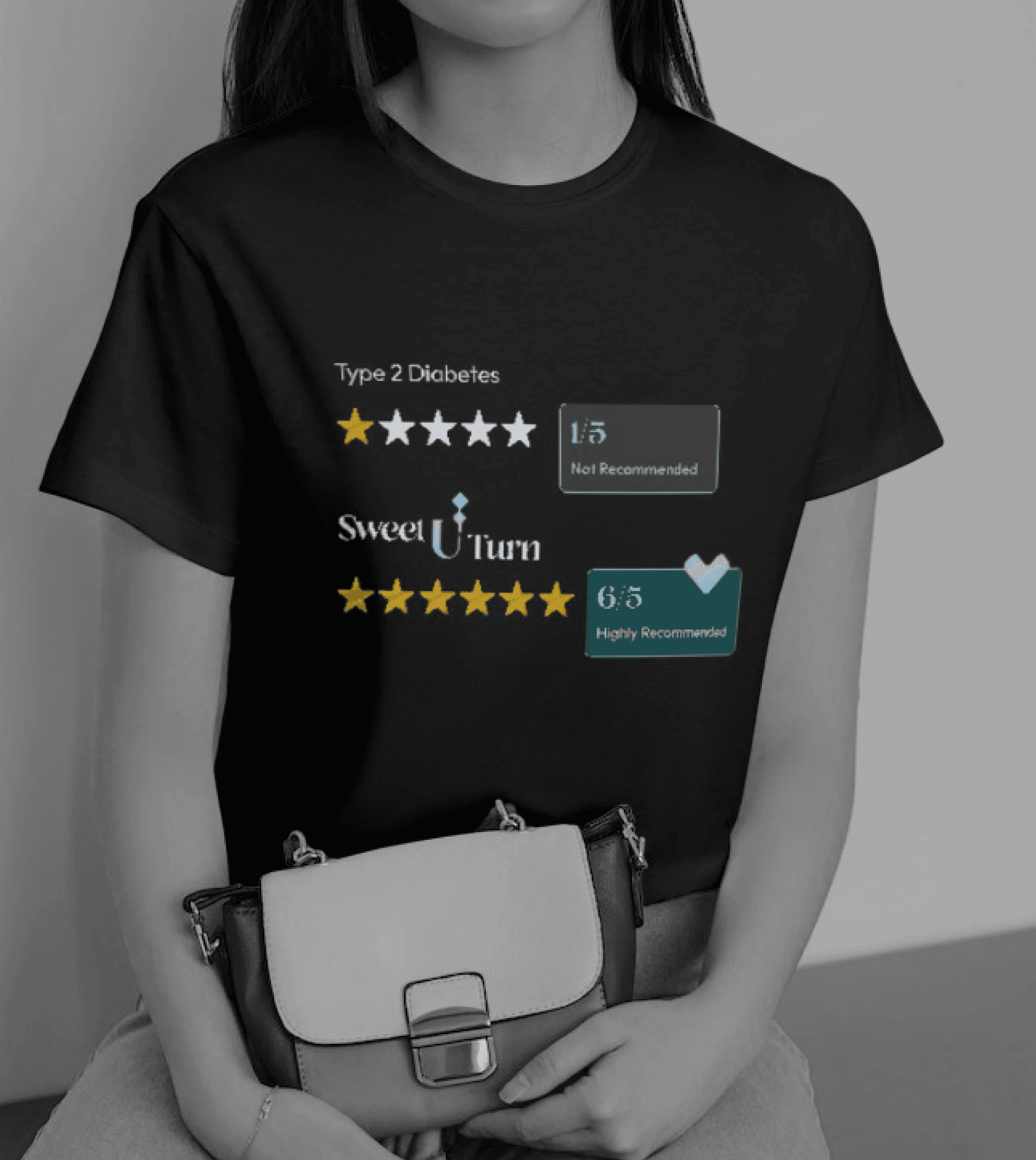


MERCH DESIGN


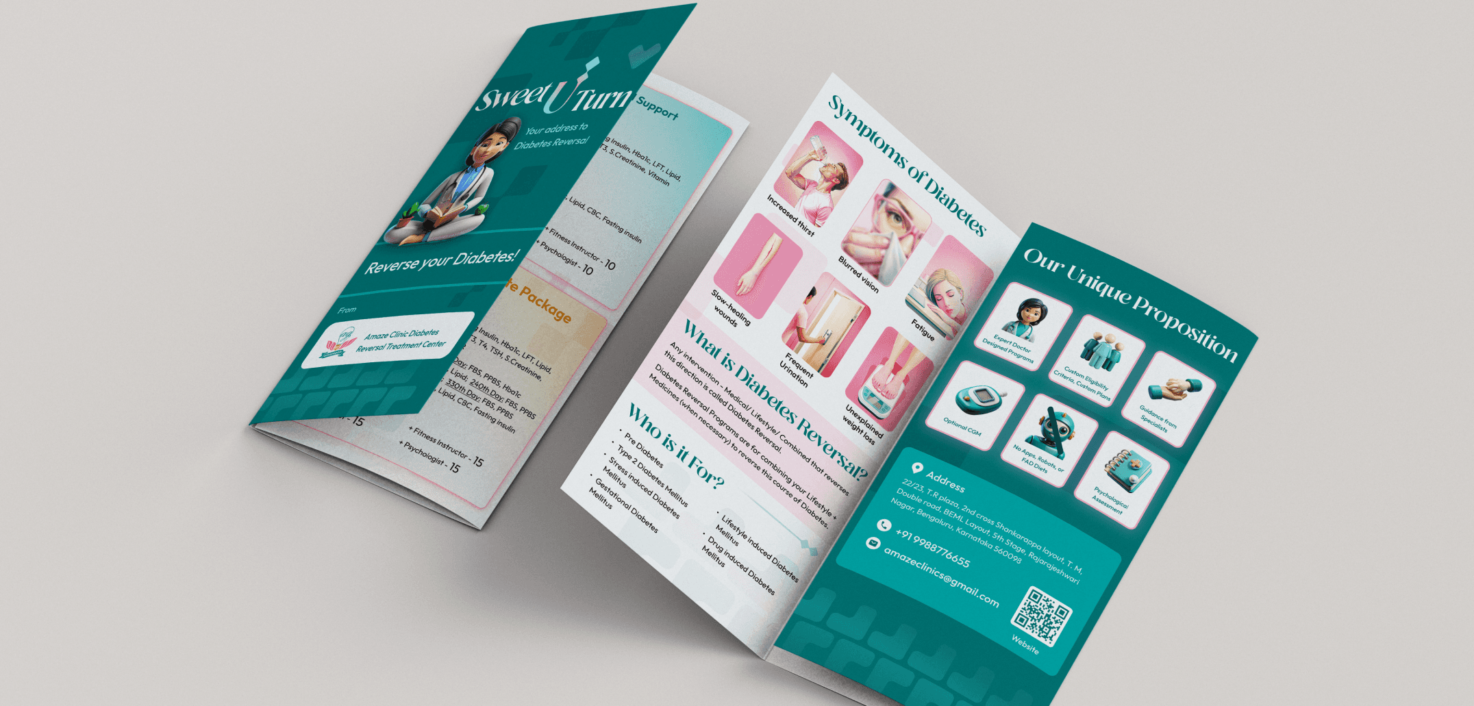


PAMPHLET DESIGN - The pamphlet design highlights the brand's services while educating clients about diabetes using 3D illustrations. I divided the services into 3 packages, with the exclusive one featuring a premium design. Key details were made easy to read for engagement, while the front and back pages included the brand introduction, USPs, contact info, and a QR code to access the website.
PAMPHLET DESIGN - The pamphlet design highlights the brand's services while educating clients about diabetes using 3D illustrations. I divided the services into 3 packages, with the exclusive one featuring a premium design. Key details were made easy to read for engagement, while the front and back pages included the brand introduction, USPs, contact info, and a QR code to access the website.

PAMPHLET DESIGN - The pamphlet design highlights the brand's services while educating clients about diabetes using 3D illustrations. I divided the services into 3 packages, with the exclusive one featuring a premium design. Key details were made easy to read for engagement, while the front and back pages included the brand introduction, USPs, contact info, and a QR code to access the website.
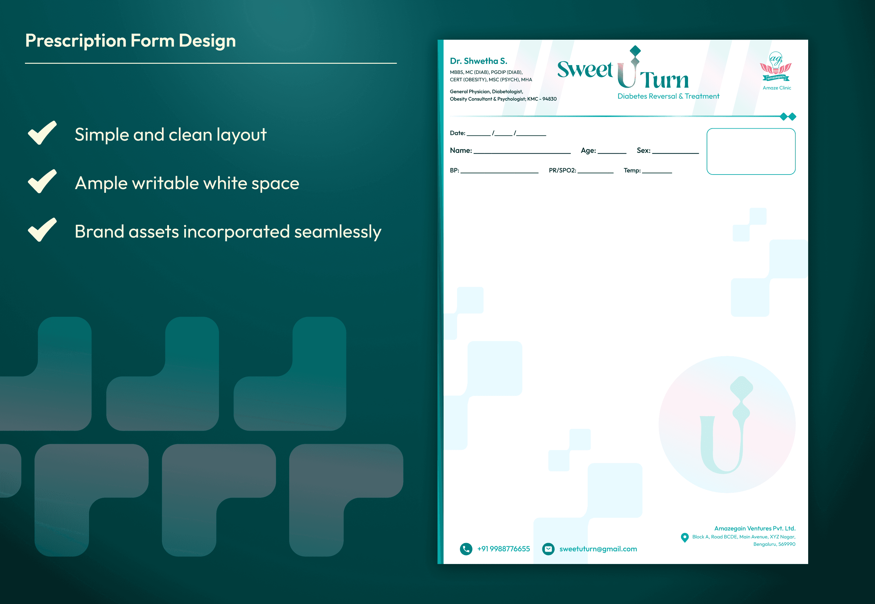


PRESCRIPTION DESIGN - For the prescription design, I opted for a simple, writable layout with ample white space, aligning with standard doctor consultation practices. Brand elements like the logo and patterns were incorporated without compromising the form's functionality.
PRESCRIPTION DESIGN - For the prescription design, I opted for a simple, writable layout with ample white space, aligning with standard doctor consultation practices. Brand elements like the logo and patterns were incorporated without compromising the form's functionality.

PRESCRIPTION DESIGN - For the prescription design, I opted for a simple, writable layout with ample white space, aligning with standard doctor consultation practices. Brand elements like the logo and patterns were incorporated without compromising the form's functionality.
WEB DESIGN
WEB DESIGN
WEB DESIGN
WEB DESIGN
WEB DESIGN STRATEGY
WEB DESIGN STRATEGY
WEB DESIGN STRATEGY
The website consists of six pages: Homepage, Services, School Sponsors, Org Sponsors, Events, and Blogs. The website showcases the brand's USPs and provides easy access to contact information and services.
A key challenge was to communicate the impact of diabetic life and how the brand's expertise can help. I optimized the content for SEO and key terms, using simple, digestible text to maintain reader engagement and reduce drop-off rates. Relevant 3D elements enhance visual engagement, while primary actions like "Contact" and "Check Eligibility" are easily accessible in main sections.
WEB DESIGN STRATEGY
The website consists of six pages: Homepage, Services, School Sponsors, Org Sponsors, Events, and Blogs. The website showcases the brand's USPs and provides easy access to contact information and services.
A key challenge was to communicate the impact of diabetic life and how the brand's expertise can help. I optimized the content for SEO and key terms, using simple, digestible text to maintain reader engagement and reduce drop-off rates. Relevant 3D elements enhance visual engagement, while primary actions like "Contact" and "Check Eligibility" are easily accessible in main sections.
END RESULTS
END RESULTS
END RESULTS
END RESULTS
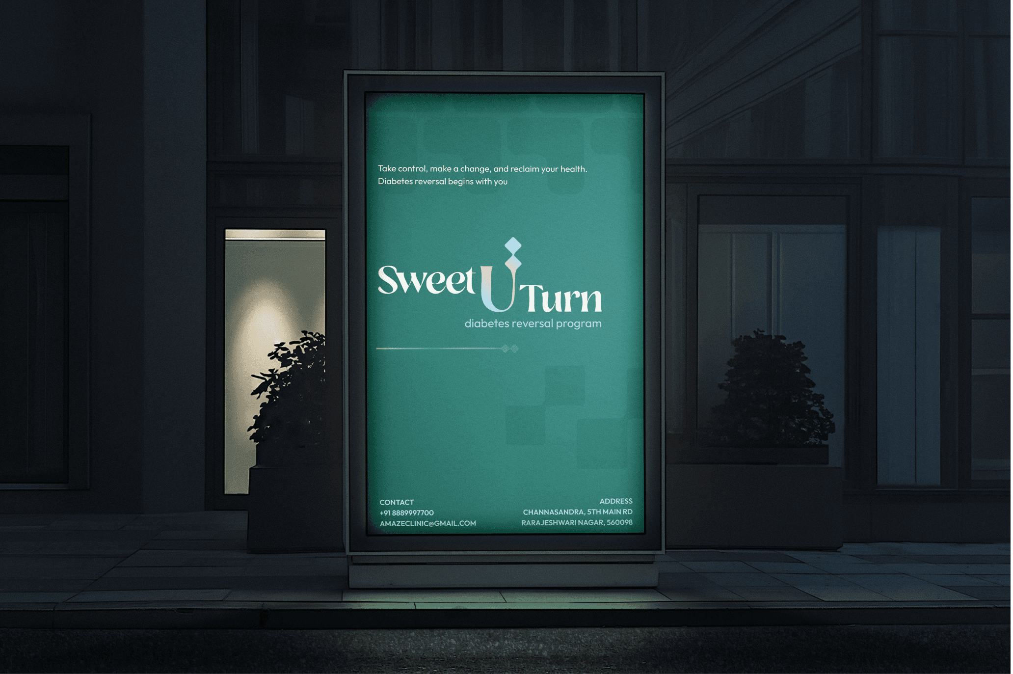


RESULTS -
Elevated brand presence with a modern, up-to-date identity and responsive website.
Reduced drop-off rate due to user-friendly design choices.
Designed an intuitive, SEO-optimized website to boost engagement.
Optimized content for better marketing and visibility.
Increased conversion rates both on the website and through well-designed brand assets in real life.


